
Hospice leaders spend a tremendous amount of time looking at individual patients. We review eligibility, documentation, certifications, plans of care, medications, visit frequency, decline, symptom management, and everything else happening at the patient level. We have to. That’s where hospice care happens, and that’s where we prove that the care we’re providing is appropriate.
But every once in a while, I think we need to get out of the chart, step way back, and look at the entire organization from 30,000 feet. Because increasingly, that’s exactly what the government can do.
With CMS continuing to expand its use of claims data and analytics, and the Department of Justice announcing its new National Fraud Detection Center on August 24, the federal government is building an even greater ability to identify patterns across taxpayer-funded programs. The new center is designed to bring together prosecutors, investigators, Inspectors General, law enforcement, and advanced analytics to identify unusual patterns and potential fraud.
For hospice leaders, that means we need to understand not only what is happening inside our individual patient records, but what our entire organization looks like when all of our data is viewed together.
If You Were Looking at Your Hospice From the Outside, What Would You See?
Most hospice leaders know their census. They know whether admissions are up or down, whether staffing is tight, and probably have a pretty good idea of what referrals look like. But that’s different from deliberately looking at the patterns your organization is creating over time.
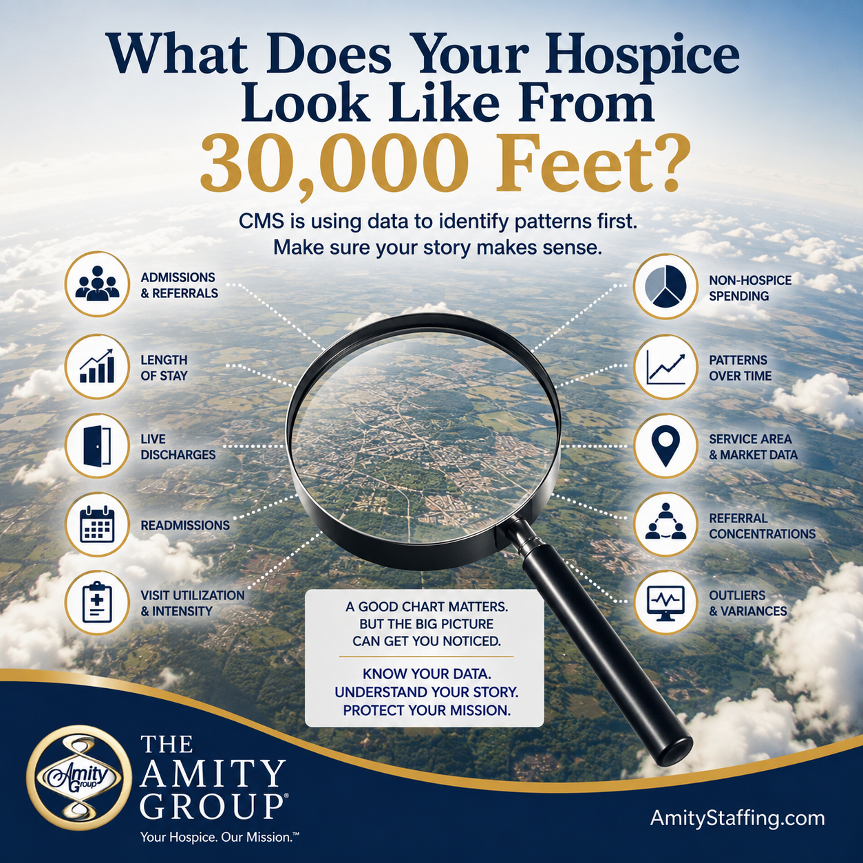
If I were evaluating a hospice from 30,000 feet, these are some of the things I would want to understand:
- Admissions and referral patterns
- Diagnosis patterns
- Average and median length of stay
- Referral concentrations
- Live-discharge rates and reasons
- Service area and market patterns
- Patients discharged and subsequently readmitted
- Changes in these metrics over time
- Visit utilization and intensity
- Significant outliers and unexplained variances
- Non-hospice Medicare spending
None of these numbers should be looked at by themselves. That’s where people can get into trouble. A high number isn’t automatically bad, a low number isn’t automatically good, and being different from another hospice doesn’t mean you’re doing something wrong. The important question is whether you understand why your numbers look the way they do.
An Outlier Isn’t Automatically a Problem, But You Better Know Why You’re an Outlier
Let’s say your hospice has a significantly longer length of stay than other hospices in your market. There may be a completely legitimate explanation for that. Maybe your referral mix is different. Maybe you serve a population with more neurological disease or dementia. Maybe another provider in your market receives more late referrals from hospitals while your organization has stronger relationships with long-term care facilities.
The number itself doesn’t tell the whole story. But if your hospice stands out significantly from everyone around you, you should know why.
The same applies to live discharges. If your live-discharge rate suddenly changes, don’t just look at the percentage and move on. Break it down. Why are patients being discharged? Are they revoking? Are they moving? Are they stabilizing? Are there eligibility issues? Did something change operationally? Did something change with a particular referral source?
The goal isn’t to make your numbers look like everybody else’s. The goal is to understand your own numbers well enough that you can explain what is driving them.
Look for Changes in Your Own Data, Not Just Comparisons With Other Hospices
One of the easiest ways to identify a potential problem is to compare your hospice with itself.
- What did your organization look like six months ago?
- What did it look like a year ago?
- Did something suddenly change?
Maybe your live discharges have historically been relatively consistent and then increase significantly over two quarters. Maybe your average length of stay begins climbing. Maybe your non-hospice spending changes. Maybe one diagnosis suddenly represents a much larger percentage of your admissions. Maybe referrals from one source increase dramatically.
There could be a completely reasonable explanation for every one of those things. But when something changes, leadership should understand what changed with it.
That’s where good QAPI and compliance programs become incredibly valuable. QAPI shouldn’t just be a binder we pull out when the surveyor arrives. It should help leadership understand what is actually happening inside the organization and identify changes before they become problems.
Follow the Data Down Into the Chart
Once you identify an unusual pattern, that’s when I would start going into the medical records.
If length of stay is increasing, look at some of your longer-stay patients. Does the documentation continue to support eligibility? Are recertification assessments telling the clinical story clearly? Are physicians receiving enough information to make an informed certification decision?
If live discharges are increasing, review those records. What happened? Was the patient truly no longer eligible? Was there an earlier point when eligibility became questionable? Was the documentation showing improvement that nobody recognized? Are there patterns involving certain diagnoses, clinicians, referral sources, or locations?
If utilization is unusually high, look at why. Were those visits clinically necessary? Do the records explain the symptom burden or circumstances that required them? If utilization is unusually low, ask the opposite question. Are patients receiving enough visits to meet their needs?
The data tells you where to look. The chart tells you what happened.
That’s why I don’t think data analytics replaces clinical auditing at all. I think it makes clinical auditing smarter.
Your Data and Your Documentation Should Support Each Other
This is probably the most important part. If your organization-level data tells one story and your clinical records tell another, that’s when I would start getting uncomfortable. For example, if your data suggests that your patients are becoming increasingly complex and requiring more services, I would expect to see that complexity reflected in the clinical documentation. If your records describe patients as stable, comfortable, independent, eating well, experiencing no symptoms, and requiring very little intervention, but your utilization tells a completely different story, somebody reviewing that information may have questions.
The reverse is true too. If your records describe profoundly debilitated, highly symptomatic patients requiring significant intervention, but your visit utilization is extremely low, that may raise a different set of questions. Compliance isn’t about making the numbers and the documentation match artificially. It’s about making sure both are an accurate reflection of what is actually happening with your patients.
Don’t Wait for the Government to Tell You What Your Data Says
CMS has already made it very clear that hospice is an area of significant fraud, waste, and abuse concern. In May, CMS implemented a nationwide moratorium on new Medicare hospice and home health enrollment and certain changes in majority ownership as part of what CMS described as a broader data-driven fraud prevention strategy.
Now DOJ has created a National Fraud Detection Center specifically designed to combine data, investigative resources, and information across government programs. This isn’t something hospice leaders should panic about, but it is something we should pay attention to.
The government has enormous amounts of claims and provider data. You don’t want the first time you learn that something about your hospice looks unusual to be when somebody outside your organization points it out.
Look at it first. Build routine organizational data review into QAPI. Look for changes. Look for patterns. Ask questions when something doesn’t make sense. Then use targeted chart audits to understand what is driving those numbers.
This Is Where Independent Review Can Make a Difference
One of the challenges with evaluating your own organization is that you know too much about it. You know why that patient was admitted. You know why that referral source suddenly increased. You know why the nurse made six visits that week. All of that background information can make something look perfectly reasonable to you.
An outside reviewer doesn’t have that context. They see the data and the medical record in front of them, which is much closer to the way an auditor or investigator may initially see your organization.
At The Amity Group, our hospice audit nurses work with agencies across the country reviewing eligibility, documentation, audit risk, and the problems that lead to denials. That outside perspective can help identify contradictions and vulnerabilities that are difficult to see when you’re inside the organization every day.
The goal isn’t to make your hospice look perfect. No organization is perfect. The goal is to know what your hospice looks like from 30,000 feet, understand why it looks that way, and make sure the medical records support the clinical reality behind those numbers. If the government can see the bigger picture, hospice leadership should be looking at it too.
To learn more about The Amity Group’s hospice audit and compliance support, visit AmityStaffing.com.
